What’s in a brand name? For one, it helps if it’s memorable (and available as a URL). But if it tells a story, too? Well, that’s the magic.
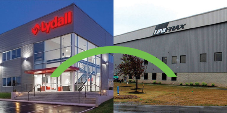
In October 2021, Unifrax — a global brand in the special materials world boasting 2,700 employees and 37 facilities in 12 countries — acquired Lydall, another giant in the marketplace boasting 23 manufacturing locations worldwide. Merging these two advanced materials brands means a future of new innovations, opportunities, efficiencies, and more, all at new speeds at a new global scale. But first, Unifrax and Lydall needed a new name, brand architecture, and brand strategy to bring to the world.
Finding a Branding Agency
In August 2021, Unifrax began searching for a branding agency that could help them create a new name, logo, and brand on an ambitious timetable. As with any merger and acquisition, an opportunity for tremendous growth presented itself, and with an ask of this magnitude, Unifrax knew they needed a branding agency that would be with them throughout the entire “M&A” process. After searching through large agencies with well-known names, Unifrax wasn’t able to find quite what they were looking for in a partner for this unique process.
Enter Echo-Factory.
Through a simple search, Unifrax found our brand mergers and acquisitions page and liked what they read about both our mission and what we’ve achieved with other clients in similar situations. With nearly two dozen M&As under our belt, it was clear that Echo-Factory had proven experience in bringing brands together and creating new ones, all while maintaining customer confidence as we created new opportunities for growth. Most importantly, Unifrax felt Echo-Factory could be the marketing agency partner to get the job done right for them.
With time being of the essence, we hit the ground running by working side by side with the Unifrax and Lydall leadership teams on-site in North Carolina for the better part of a month. This included attending numerous workshops and meetings, gathering data, and gleaning as much as we could about the two companies, all to eventually build the vision of the new company to be. Creating a new name, logo, and brand on such a schedule meant that close collaboration and communication were essential. In round after round of ideas and presentations, we sprinted hand in hand with Unifrax and Lydall to get to the finish line. There were plenty of strong opinions, pivots, and late nights, but Echo-Factory was as dedicated as our client in creating something impactful and meaningful.
Finding a Brand Name and Logo
The client recognized that the naming and branding of this venture needed to be an absolutely thorough exercise — one big enough to bring two entirely separate, unique, and established brands together. That meant Unifrax had to look at who they wanted to be and how they wanted their stature to be perceived in the global marketplace. A name to convey the kind of worldwide reach and innovation capability they would soon have. No small order.
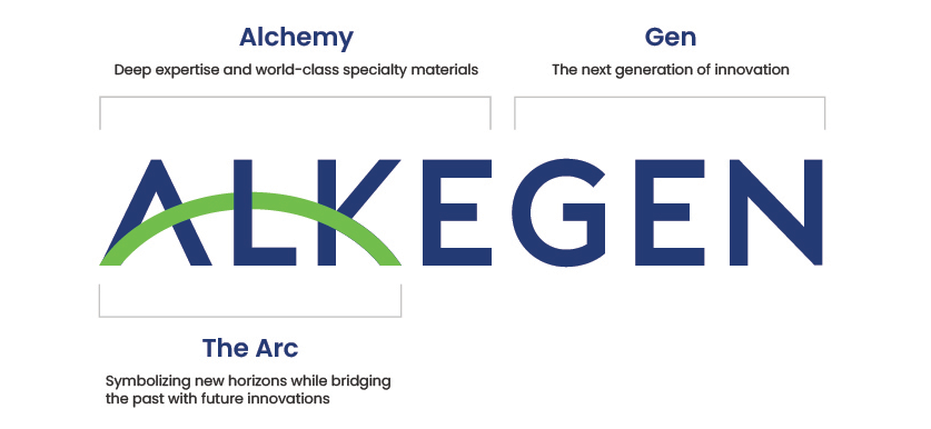
Working closely with the C-suite team from both companies, “New Company” was described as smart, disruptive, innovative, knowledgeable, and, above all, transformational. Thousands of names and logos were explored based on these descriptions. We even got as far as brushing up to the finish line on a name and logo, but just as we were about to pop the champagne in the final moments before the official sign-off, a more extensive legal search deemed it risky. High fives halted, and the celebration on pause, we began the process anew. Fortunately, we quickly found strong support across the agency-client aisle for a concept that joined “alchemy” — the study and practice of changing and creating new materials (transformation) — and “new era” or “new generation” for the future to come. And so, after a few more weeks and a few more sprints, both the initial “Alke-Gen” name and story were born.
As a global brand, Alkegen has customers that speak numerous languages, so the logo mark had to be as clear and as easy to understand as possible. The “Alkegen Arc” (as it came to be branded) bridges the opening letters while also visually signaling action from the present toward the future. This is all rendered in green, symbolizing the new brand’s fierce commitment to creating sustainable, environmentally responsible advanced materials. Alkegen’s strong yet approachable typography was chosen to symbolize its energetic pace and focus on growth, with a bold color palette representing environmental elements.
Honing the Brand
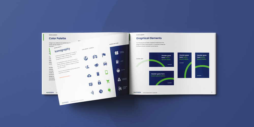
Building on the initial visual choices, the rest of the brand’s elements — including persona, iconography, photography, and layout style — developed and expanded across every touchpoint. The true test was building the brand guidelines in real-time as we simultaneously designed trade show booths, announcement and sales videos, and most importantly, the website. Working this quickly required a dedicated team who intrinsically knew both the brand inside and out and the work of building one to deliver high-level creative and thinking.
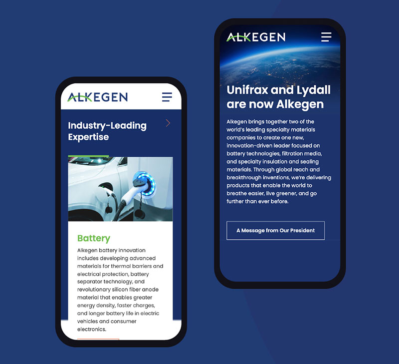
Another test that took particular attention was to balance form and function. Ideas like “new, disruptive, transformative, inspiring” are often portrayed with edgy, hyper-stylization, and trendy choices that date themselves quickly. As a company with ambitions that stretch decades into the future, Alkegen required branding that felt modern with an eye toward timelessness. And since Alkegen’s employees and customers span five continents, critical touchpoints like the site needed to balance the brand’s future-forward mission with the need to convey a great deal of content and technical information in a clean, modern feel — in line with its technical capability and promise. To do so, we balanced the brand’s signature blues and greens with plenty of white to create a feeling of energy, vibrancy, and openness that translated across collateral materials and continents. Though it may have seemed a tall order when we were first contacted, we were able to help create a new brand and story from the ground up thanks to close collaboration and open communication between our team and theirs. The result is an inspiring new brand with a mission “to help the planet breathe easier, live greener, and go further than ever before.” As a branding agency based in the heart of Pasadena, we’re proud to have played our part in bringing it to the world.
“It started with a call to an unknown agency in late July and after just a few conversations it just clicked. By the beginning of August, Echo-Factory had dropped everything and set on a mission with us facing big asks and incredibly tight deadlines. By November/December our new brand was coming to life right before our eyes. It was quite the process with critiques and opinions aplenty, and lots of education for us on the finer points of branding. On behalf of the entire Alkegen teams and leadership teams– we are thrilled with the results. There are times ‘thanks’ just doesn’t seem enough, but we really mean it!”
– D. Myers, Director, Global Marketing Communications