
The Headington Institute came to Echo-Factory with a simple ask: Redesign a logo created by one of the most iconic graphic designers in the world. Oh, and BTW, people are outraged about the last time someone tried.
“Graphic Design Celebrity” isn’t a phrase that most of us think about much. If you’re not a design nerd, your mental list of famous graphic designers probably goes something like, “That guy with the Campbell’s Soup Cans, and, umm …”
But if you took a graphic design course in college, or are something of an enthusiast, the next name on your list might be Milton Glaser.
Glaser designed an iconic poster for Bob Dylan; worked with JFK Jr.; created beloved posters, ads, logos and fonts; was the first graphic designer to receive a National Medal of the Arts (thanks Obama); was profiled by The New York Times at age 90; and has had his work exhibited in places like the Pompidou in Paris and the Museum of Modern Art in New York.
But if none of that rings a bell, here’s what will: He’s the guy who created the original “I ❤️NY” logo.
Yes, that thing that millions of tourists buy every year, that’s the official motto of New York and that generates about $30 million in revenue for the state.
That guy.
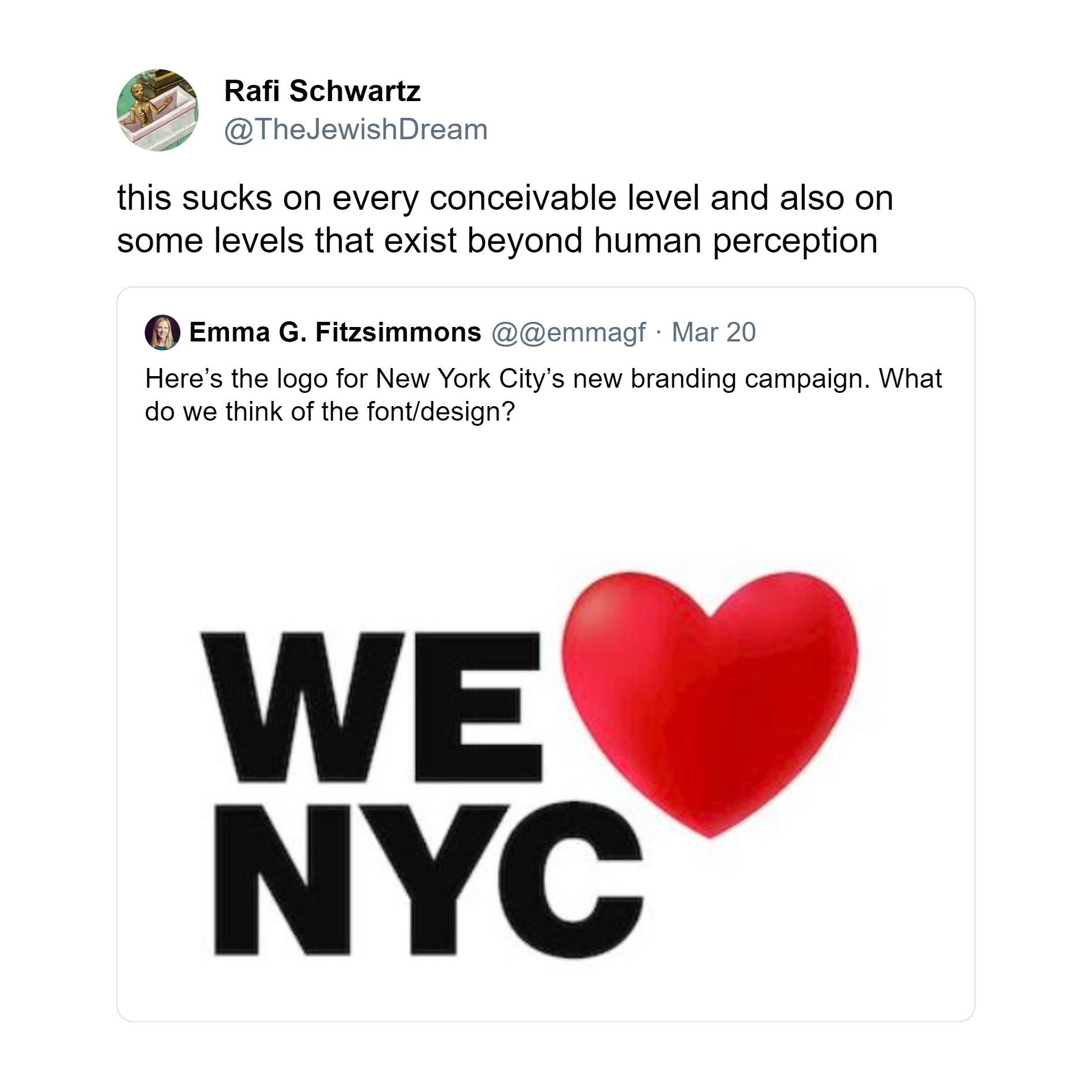
Earlier this year, an organization in New York City decided that Glaser’s work no longer suited their needs. So, they worked really hard and came up with “We ❤️ NYC.”
The results were predictable.
New Yorkers were “outraged.” The internet went “into a frenzy.” And locals said, “Thanks, We Hate It.”
In the pages of The New Yorker, it was “a flop.”
In the words of one Twitter X user, the redesign “sucks on every conceivable level and also on some levels that exist beyond human perception.”
Harsh. And honestly, the new logo isn’t the problem. It’s probably fine.
We are not in the business of taking cheap shots. We absolutely feel for the poor designers and art directors who were handed this quixotic task. Because, obviously, “I ❤️NY” does not need a redesign; it is one of the most iconic and beloved logos in the world. It already does its job very, very well.
The only way the team behind “We ❤️ NYC” could have succeeded is by saying “No thank you” to the project.
So you can imagine that in this context, we felt a little trepidation when we were asked to redesign another logo created by Milton Glaser earlier this year.
Echo-Factory’s Milton Glaser Moment
We have a strict rule: We only work with clients we like. But there are some clients we especially like to work with, and the nonprofit Headington Institute in Pasadena is one of those.
The Headington Institute provides mental health support, training and tools to people operating in challenging environments. Imagine you’re an aid worker helping refugees in a war zone. The work you’re doing is incredibly important, but you’re also experiencing your own trauma and mental challenges, operating in a dangerous place, and likely being separated from your family and friends for months at a time.
Studies have shown that 79% of aid workers in critical scenarios report mental health issues, and about one third of international staff working for aid agencies experience PTSD.
Headington helps these people, preparing them for the challenges they’re going to face, supporting them while they’re facing those challenges and helping them to deal with the mental impact of those experiences long after they’re over.
In recent years, they’ve expanded their work beyond their traditional focus on international NGO workers to include local teams, schools, nonprofits, displaced people, first responders and more in 146 countries around the world.
We first worked with the Headington Institute in 2021 when we took them through a Brand Catalyst Research and Strategy project that focused on helping them communicate more effectively with people and organizations who could benefit from their services.
That was when we first learned that Glasier had donated the institute’s logo.
Our Brand Catalyst project gently made reference to the fact that we weren’t confident that the logo still met the organization’s needs, but while the staff we were working with agreed, they were also concerned that changing it would meet with some internal resistance that could distract from our bigger-picture goals. We were happy to sidestep that particular landmine, and focused on helping Headington reach their goals in other ways.
But, in early 2023, the Headington Institute brought in a new CEO, Dr. Diane Flannery. Dr. Flannery found our Brand Catalyst work, reviewed it and decided it was time for a brand that more closely reflected who Headington Institute is in 2023 — not who they were back when their last logo had been created. Internal resistance or not.
Would we help?
Why We Said Yes to Updating a Milton Glaser Classic
What makes a logo “good”?
There are lots of ways to answer that question, and we’re not even going to try on a bigger, universal scale.
But for us at Echo-Factory, and the promises we make our clients, it’s an easy answer.
Our promise to our clients is that we’ll help them grow. We’ll understand the challenges they’re facing and the goals they want to achieve, and then help them leverage marketing to achieve those goals.
So, for us a good logo is one that supports the goals of an organization. A logo that might need changing is one that gets in the way of those goals.
In the years since Glaser designed the original Headington logo, the world of international aid has undergone a transformation. A big part of that transformation is a reckoning with the impact of colonialism and colonialist attitudes within the international aid community.

This is a much bigger issue than we can address here, but broadly, the (predominantly white and Western) international aid community has been working hard to not present themselves as “saviors” to the (predominantly non-white and non-Western) communities and cultures where they operate.
Instead, responsible, forward-thinking organizations like the Headington Institute are working to present themselves as partners, on equal footing with the communities and organizations they serve.
This brings us back to what made it easy to say “yes” to redesigning a Milton Glaser logo.
Glaser’s Headington logo was a larger hand, offering a supportive gesture to a smaller hand. At the time it was created, we have no doubt that it was an appropriate symbol that reflected the organization’s needs and Glaser’s unimpeachable talents. In 2023, Headington and the entire industry was in a different place. Today, the logo could be seen as suggesting that Headington saw itself as a paternalistic figure, which is absolutely not the way Headington sees or wants to present itself.
Building on Glaser’s Foundation
Conceptually, both Headington’s leadership team and Echo-Factory’s creative team were still very fond of much of what Glaser’s logo represented. We all liked the humanity, support and kindness it represented. As our creative team went through a mission, vision and values process with Headington — and then a brand refresh — it became clear that those were qualities that needed to be maintained in Headington’s updated logo.
And after a few months of creative concepting; revisions and refinements; and presentations to employees, board members, clients and supporters, those are the qualities that came through in the final logo.
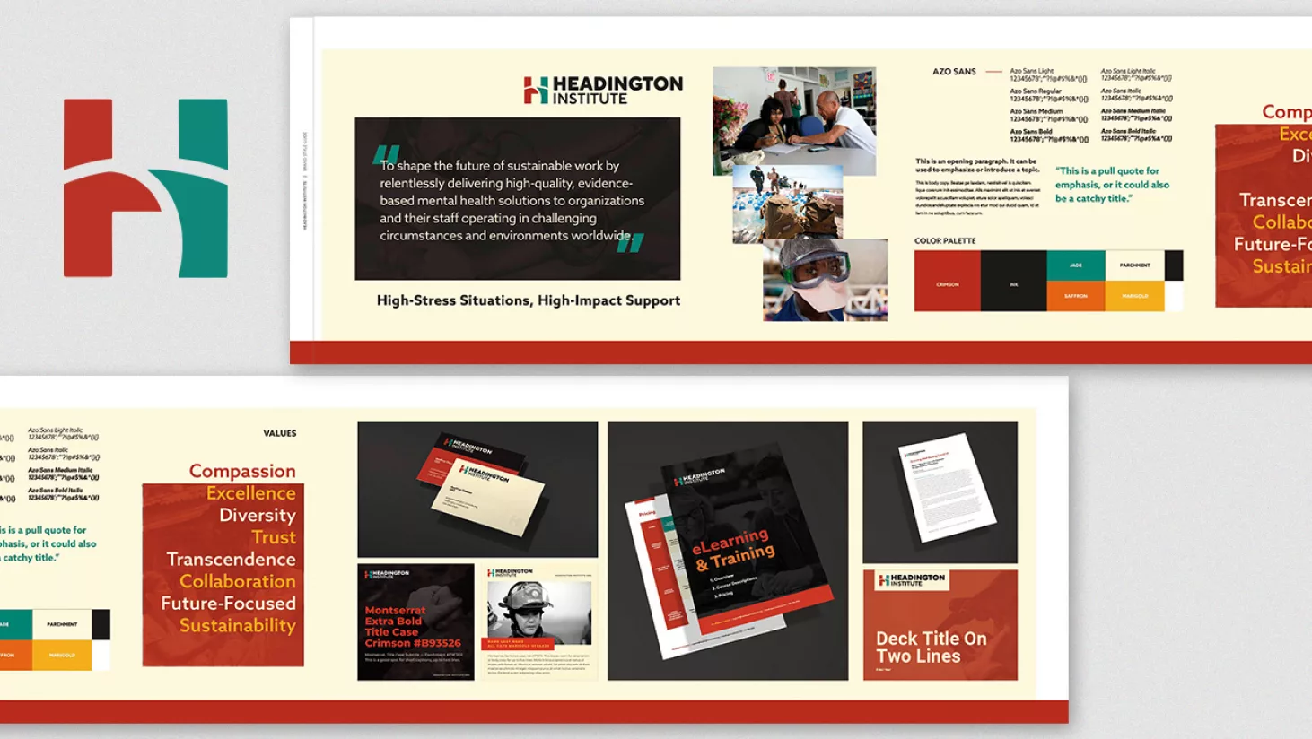
Headington’s updated logo still represents two people connecting, though now clearly as equals. Two human figures reach towards each other, representing the way that Headington connects to its community of clients and partners. The “H” now represents the brand more directly when its used on its own, and provides a strong modern sensibility that reflects Headington’s overall updated brand identity.
So far, the media hasn’t reported any outrage or hate directed at this particular update of a Glaser classic, and more importantly, Headington and its customers are quite happy with it.
We even hope that Glaser himself might approve, since he’s the one who famously said, “Solving any problem is more important than being right.”
We agree completely.