They said it couldn’t be done. Not in three months. They’d need at least six, preferably nine.
And so, when everyone else said no — including some of the biggest and most well-known names in agency-and–consultancy-land — we said yes.
TAKE A CHANCE ON ME
The ask was relatively straightforward, yet encompassed layers of considerations and complexities — all in an aggressive three-month time frame. Unifrax, one of the world’s leading specialty materials makers, purchased another industry leader, Lydall, and needed a name and logo for the brand-new entity. But this was more than just a coat of new brand paint and a catchy name: It was bringing together two companies with long histories, proud workforces and strong identities that, when combined, would transform into a globe-spanning giant with over 70 manufacturing facilities and 9,000 employees worldwide. A “New Co” positioned for global leadership, complete with the culture, vision, and values worthy of its ambitions.
Our confidence to say “yes” — and say yes to the ambitious three-month time frame — came from 21 previous successful M&A projects.
Deb Meyers, head of marketing at Unifrax, said: “It started with a call in late July. We didn’t know you, you didn’t know us, and somehow it seemed right after several conversations. (Echo-Factory) dropped everything and set us on a mission in August facing big asks and incredibly tight deadlines.”
UP CLOSE AND PERSONAL
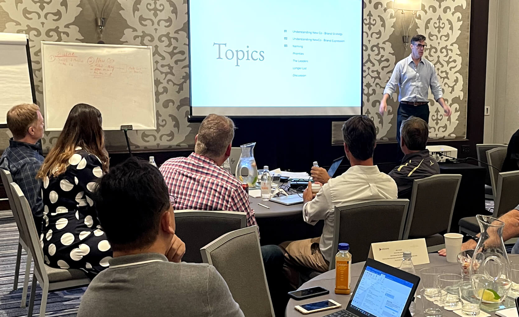
Plane tickets purchased, we got to work right away, traveling to North Carolina for intensive sessions with senior management from both companies as we began fact-finding, strategizing, and conceptualizing what New Co could be. Our close, side-by-side collaboration with senior leadership soon began bearing fruit with thousands of names and logos explored, presented, and debated.
WHAT'S IN A NAME?
Our brand and archetype exploration described New Co as smart, disruptive, innovative, knowledgeable and, above all, transformational. After an initial winner was scuttled by a thorough international trademark search, we regrouped and soon began circling two concepts — “alchemy,” the study and practice of changing and creating new materials (transformation), and “new era” or “new generation” for the future to come — that, when combined as “Alke-Gen,” yielded something unique and future-forward, just like the two companies that came together to create it.
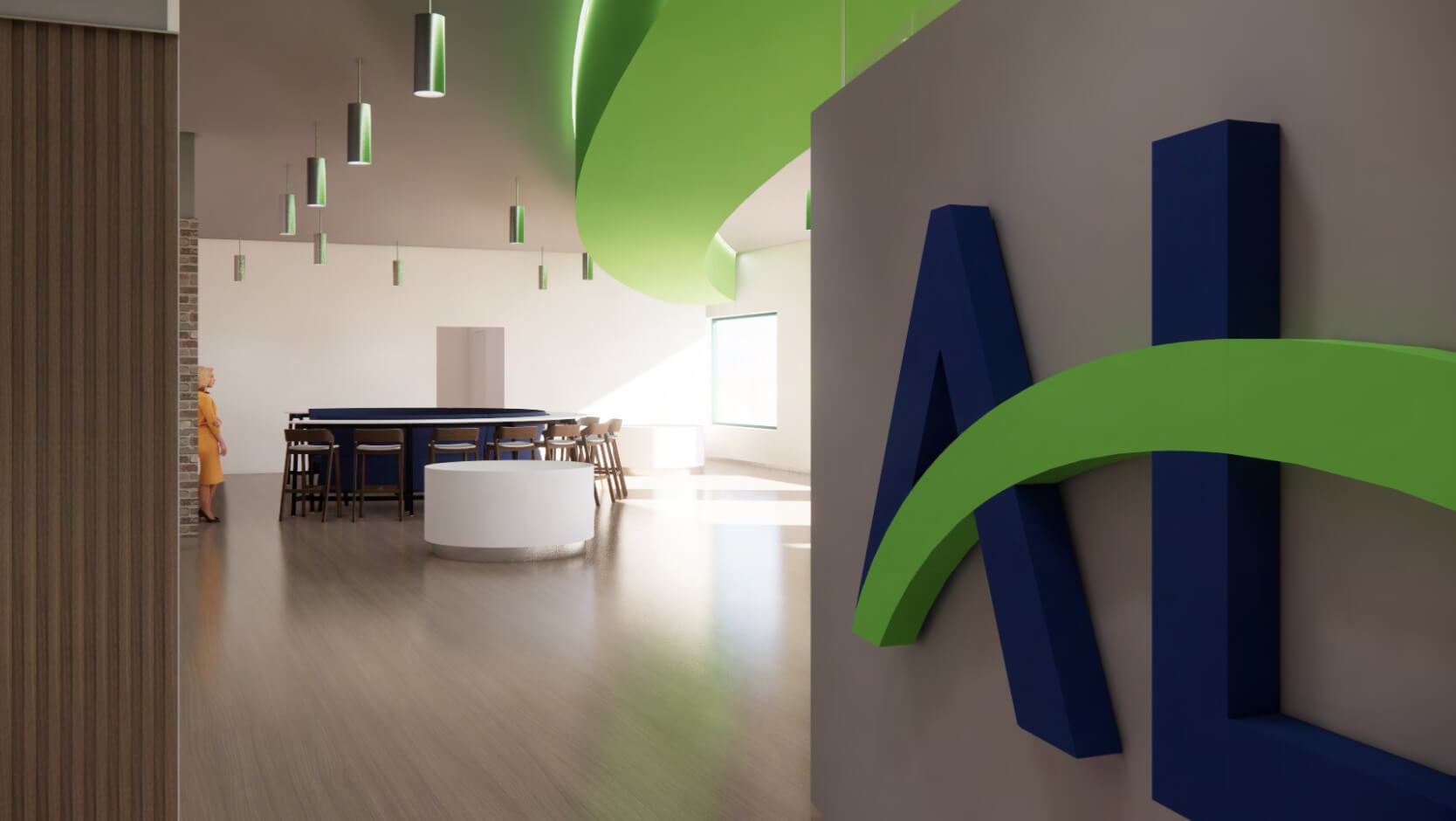
CREATORS OF THE ALKEGEN ARC
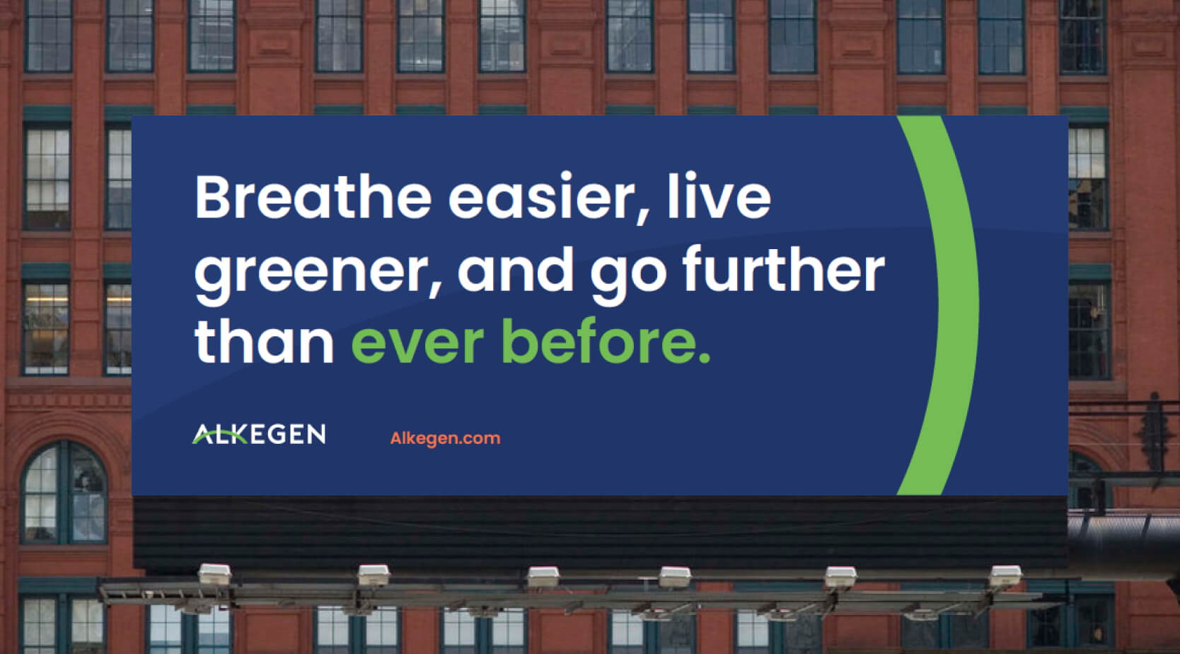
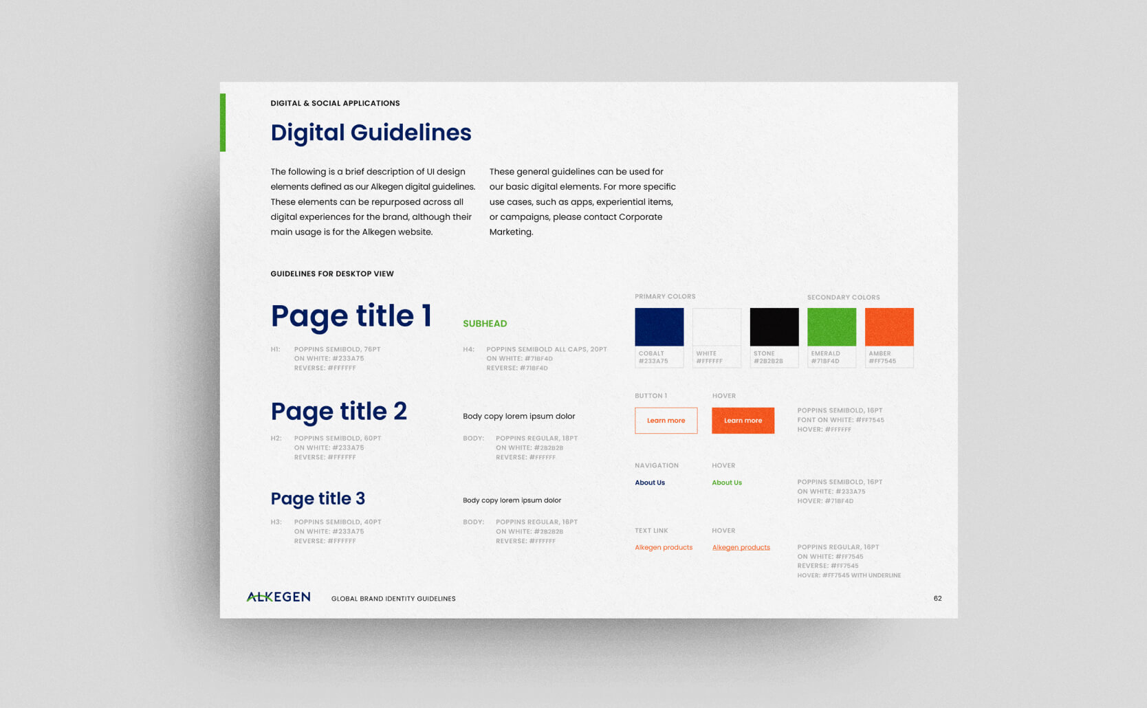
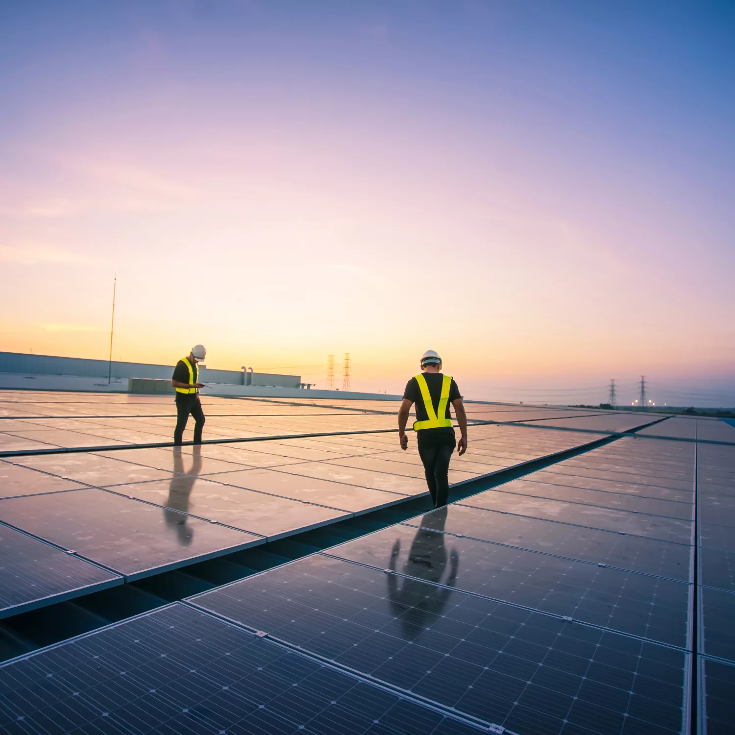
Soon enough, a logo that could be easily translated across Alkegen’s global workforce took shape. A key element of this mark was the soon-to-be-christened “Alkegen Arc” rendered in the brand’s signature green. Representing a bridge from today’s technology to a brighter, cleaner future via the brand’s fierce commitment to creating sustainable, environmentally responsible advanced materials, the instantly iconic arc was quickly put to work across a range of touchpoints. Alkegen’s strong yet approachable typography was chosen to symbolize its energetic pace and focus on growth, with a bold color palette (white, blues, greens, ambers) representing openness and environmental elements.
We plowed through a first name and disappointment in September, and got back on track and close to a new name in October. And by November and December, this company and brand were coming to life on paper before our very eyes.
Deb Myers
YES, AND...
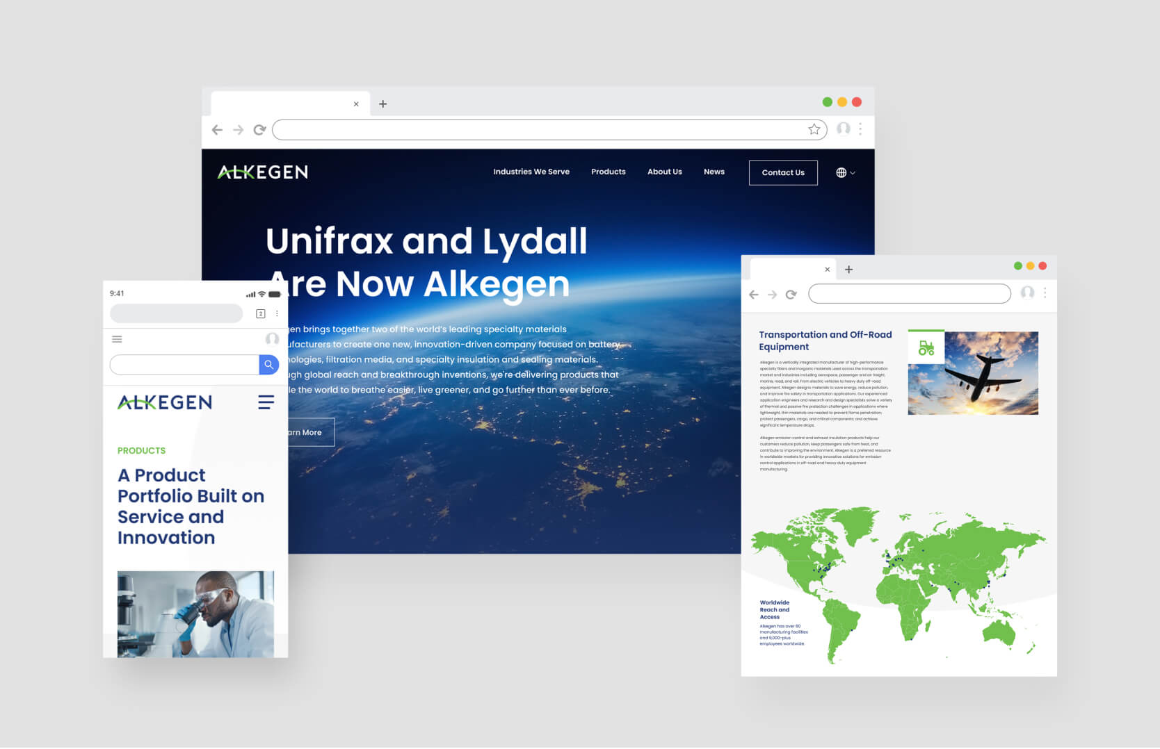
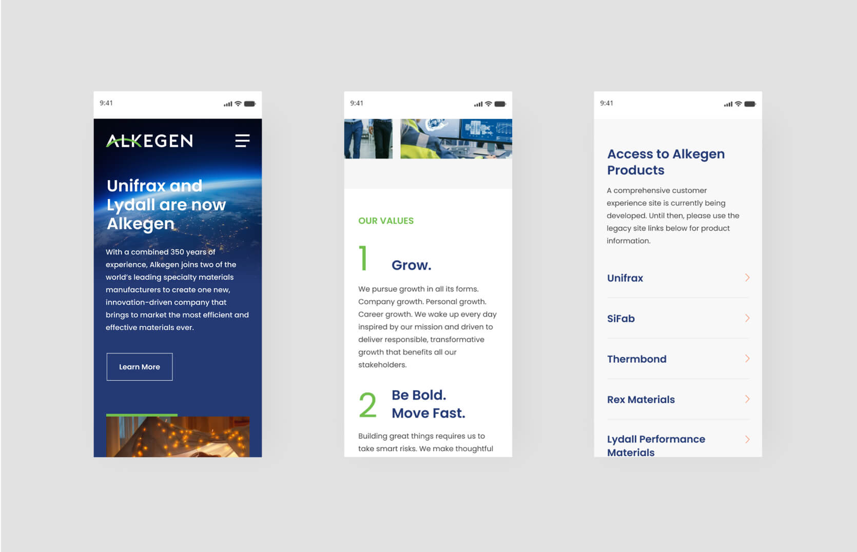
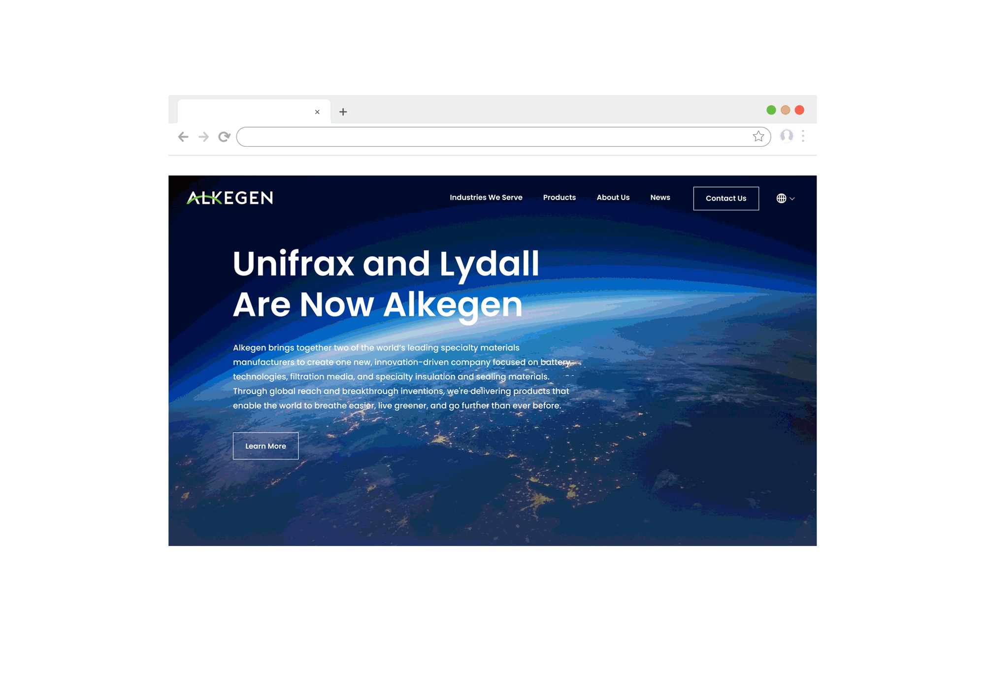
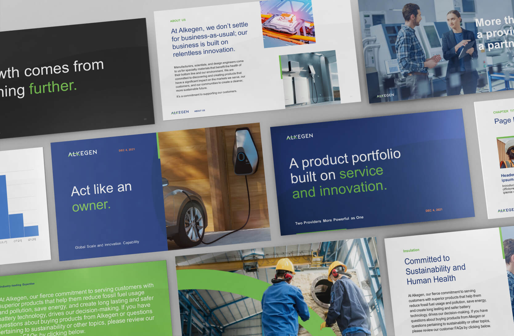
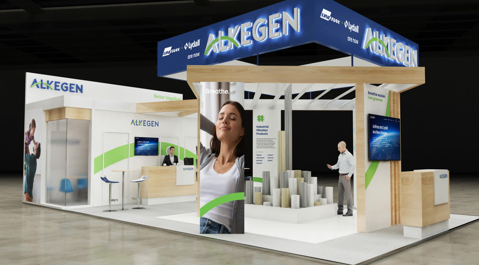
Happy to continue a productive relationship, the newly named Alkegen quickly increased the scope of work — including a 131-page guidelines deck, website, trade show booth, and series of videos — to bring the rest of the brand to life ahead of its January 2022 launch. Building on the initial visual choices, the rest of the brand’s elements — including persona, iconography, photography, and layout style — developed and expanded from the guidelines and onto every touchpoint.
CONTINENTS AND COLOR
The true test was building the brand guidelines in real time as we simultaneously designed the trade show booths, announcement and sales videos — and, most importantly, the website. Ideas like “new,” “disruptive,” “transformative,” and “inspiring” are often portrayed with edgy hyper-stylization and trendy choices that date themselves quickly.
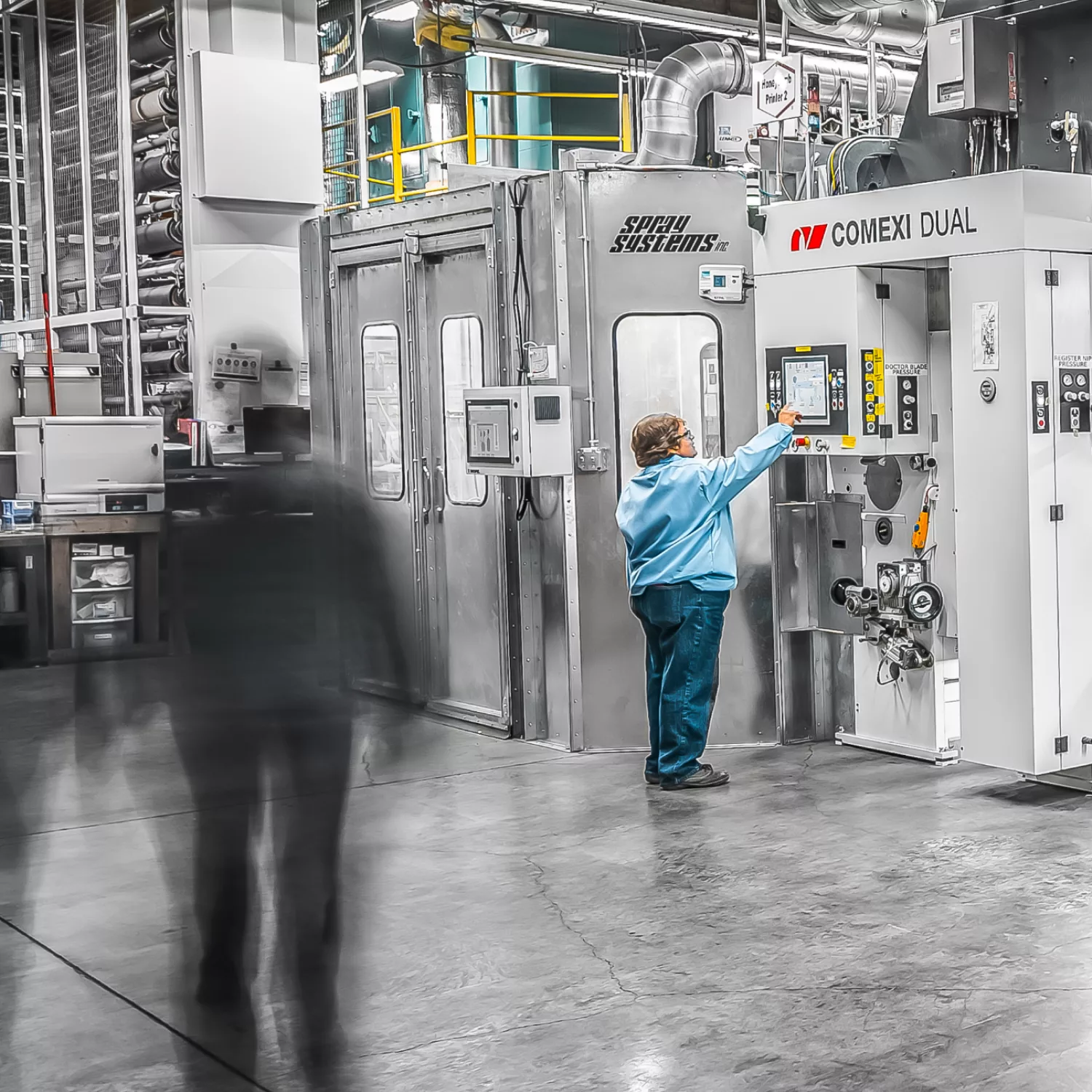
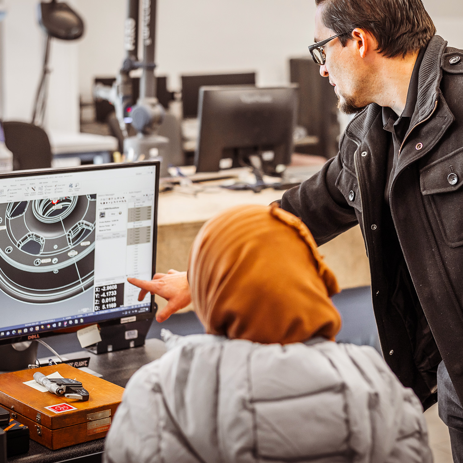
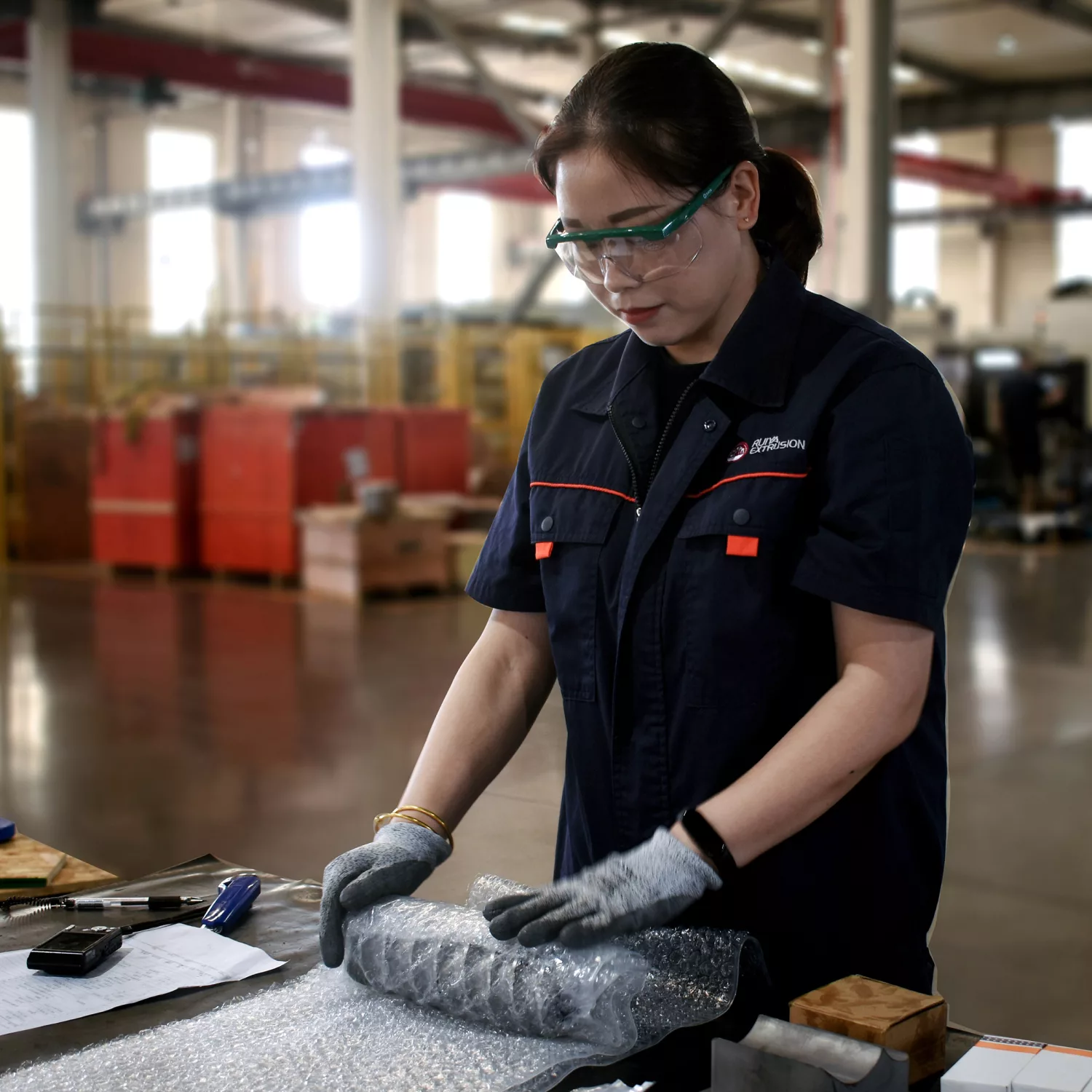
As a company with ambitions that stretch decades into the future, Alkegen required branding that felt modern with an eye toward timelessness. And since Alkegen’s employees and customers spanned five continents, critical touchpoints like the site needed to balance the brand’s future-forward mission with the need to convey a great deal of content and technical information in a clean, modern feel — all in line with its technical capability and promise. To do so, we balanced the brand’s signature blues and greens with plenty of white and white space to create a feeling of energy, vibrancy, and openness that translated across collateral materials and continents. This all blended with the newly defined photo aesthetic that harmonizes the human with the technical, as well as the healthy communities with cutting-edge factories.
LIGHTS, CAMERA, ACTION
Creating all this high-level work required the continued trust and close collaboration that had brought us this far, and that included another set of plane tickets, this time to Buffalo, as we filmed a series of videos to help put Alkegen in motion. In addition to an announcement video to impress investors, we had an even bigger audience to impress with our next video: Alkegen’s internal sales teams. This nearly seven-minute epic had to not only get Alkegen’s “frontline” walking in step with the new brand, but it had to also get them ready to run through brick walls for it. Suffice to say, after its sales conference debut in Dallas, there were pickup-truck-sized holes in every side of the building.
IT'S IMPOSSIBLE UNTIL IT ISN'T
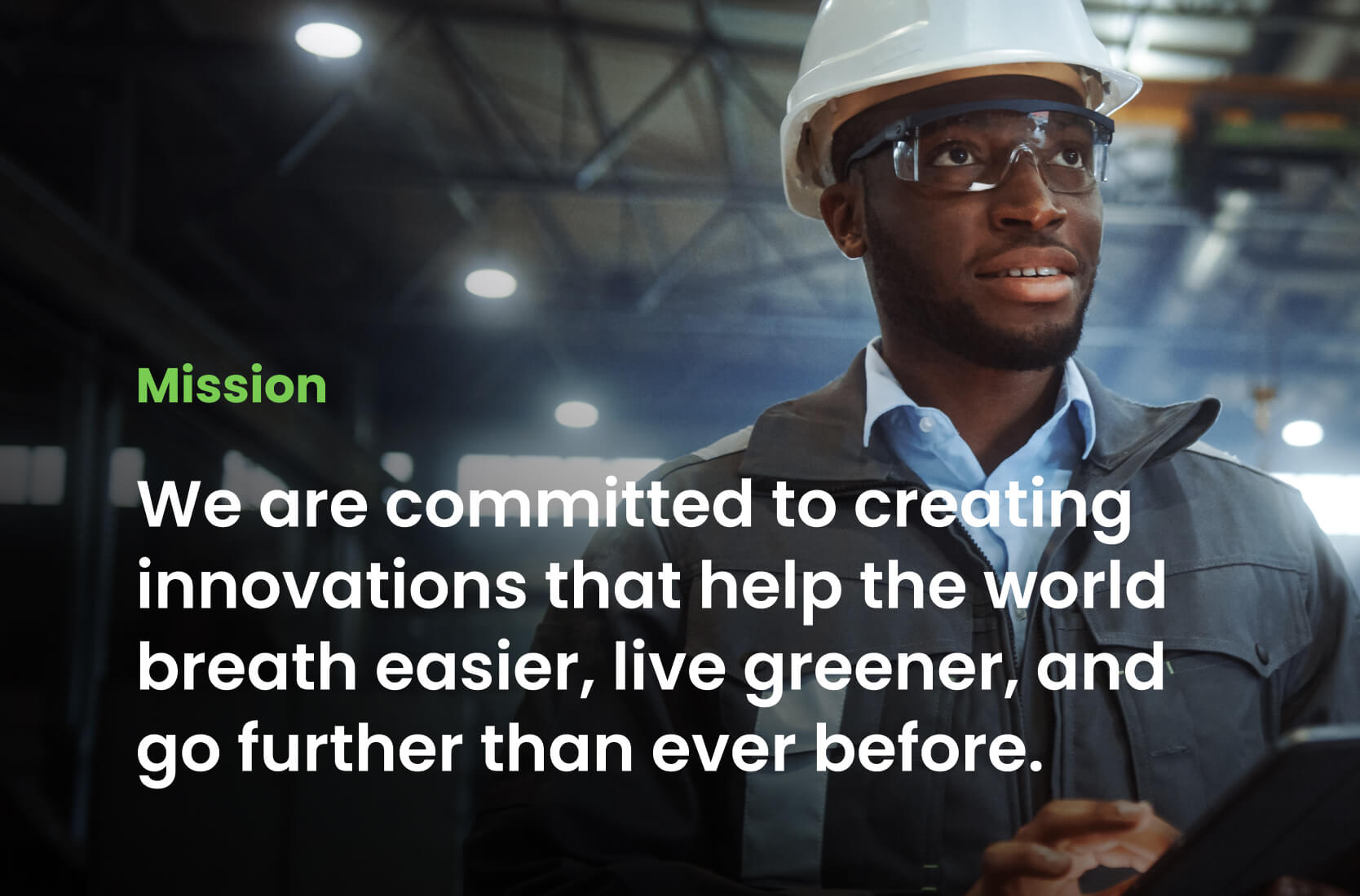
Though it may have seemed a tall order when we were first contacted, we were able to help create a brand and story piece by piece thanks to open communication and collaboration between our team and theirs. Working side by side with the specialty materials leader, we were able to help write the first chapters of a company committed to “helping the planet breathe easier, live greener, and go further than ever before.”
Thank you for meeting incredible deadlines, for putting up with lots of opinions and critiques, for educating us on the finer points of branding, colors, voice and tone, and for making us a priority. The branding is beautiful — thanks to all of you.
Deb Myers
A new brand with nearly a billion dollars in revenue, built from the ground up in just over three months. And it all started with saying “yes.”
In over 30 M&As in 15 years, our expertise has helped companies build their value before acquisition, confidence during the process, and create growth opportunities after.